
The Psychology Behind Effective Billboard Advertising: How to Make Your Ad Memorable
Introduction
In today’s attention-starved world, grabbing and holding someone’s attention is a marketing superpower. While digital ads come and go in a scroll, billboards demand attention in the real world. When used correctly, they leave a lasting impression. What separates a forgettable billboard from one that becomes the talk of the town? The answer lies in psychology.
This blog explores the psychological triggers that make billboard advertising powerful, memorable, and persuasive. From visual design to human behavior, we will decode how psychological principles help your brand get noticed and remembered.
First Impressions Count: The Power of Visual Simplicity
The 3-Second Rule
Drivers have just a few seconds to glimpse your billboard. This is where the “3-second rule” applies—your message must be understood within 3 seconds. This rule influences every aspect of billboard design, from text length to image clarity.
Why Less is More
Complexity kills memory. The more cluttered your billboard, the harder it is for viewers to retain your message. Simplicity allows your brand to cut through visual noise. Clean layouts, bold headlines, and focused visuals create a strong first impression that lingers in the viewer’s mind.
Simple Designs Win Attention
A clutter-free billboard speaks volumes. A large, impactful image with a short, punchy phrase (like “Think Different” or “Just Do It”) connects emotionally and cognitively with your audience. Simplicity encourages recall, which is the holy grail of outdoor advertising.
Color Psychology in Billboard Advertising
Emotional Triggers of Colors
Colors communicate emotions faster than words. Red evokes urgency and excitement, blue inspires trust and calm, yellow conveys optimism and energy. Understanding the emotional language of color helps advertisers shape viewer perception instantly.
Brand Association and Color Choices
Successful brands use colors deliberately. Coca-Cola’s red, Facebook’s blue, and Safaricom’s green are all carefully chosen to evoke specific responses. Billboard advertisers must choose color schemes that align with their brand identity and desired emotional response.
Contrast and Visibility
A billboard must be visible from a distance. High contrast between background and text ensures readability. Poor color contrast may cause your message to fade into the background. For maximum impact, pair complementary colors and avoid placing similar tones side by side.
The Science of Fonts and Typography
Readability is Everything
Fonts must be legible at high speeds and from long distances. Sans-serif fonts like Helvetica or Arial perform better than decorative fonts. A bold font with ample spacing increases clarity, especially under low lighting or motion blur.
Size and Structure
Font size must be large enough to read from 100 meters away. Line spacing and character spacing should aid quick reading. Structure your message in hierarchy—headline first, subtext second, call-to-action last.
Psychological Impact of Font Styles
Fonts carry emotional weight. Bold fonts signify confidence and urgency. Script fonts suggest elegance or creativity. Match the font’s personality with your message tone. Consistency in typography also reinforces brand identity.
Location + Context = Relevance
Context Shapes Perception
A great billboard placed in the wrong location is wasted. Location influences interpretation. A fitness brand billboard near a gym resonates more than the same billboard in an industrial area.
Environmental Psychology in Advertising
People process messages differently depending on their environment. In traffic-heavy zones, bold messages stand out. In scenic routes, emotionally-driven messages may perform better. Match your billboard message to the psychology of the moment.
Smart Billboard Placement
Strategically placed billboards in high-traffic zones ensure repeated exposure. Near malls, universities, or commuter routes, relevance meets frequency—two keys to ad recall.
Memory Triggers: Using Repetition, Emotion & Storytelling
How Repetition Aids Recall
Repetition is a basic psychological principle of memory. Seeing a brand message repeatedly, especially in consistent design, increases familiarity and recall. This is why national brands buy multiple billboards across cities.
The Baader-Meinhof Phenomenon
Also called the frequency illusion, this phenomenon occurs when people suddenly start noticing something more after seeing it once. Billboards take advantage of this by placing repetitive yet simple messages across strategic locations.
Storytelling in a Glance
Even in limited space, a compelling visual story can unfold. A single image of a happy family next to a new home, paired with a brand name, tells a story of trust, dreams, and success. People remember stories far more than statistics or taglines.
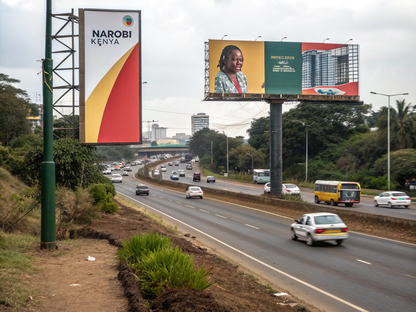
The Role of Faces, Emotions, and Human Connection
Why Faces Work
Humans are hardwired to respond to faces. Eye-tracking studies show that people look at faces first in any visual scene. Including expressive human faces in your billboard draws instant attention.
Emotional Expression as a Magnet
A smiling child, a look of surprise, a determined stare—emotional expressions evoke empathy and curiosity. Emotional connection boosts engagement and memory retention.
Eye Gaze and Directional Cues
Where a face looks can guide the viewer’s attention. If a person in your billboard looks toward the call to action or product image, it subtly directs viewers there too. This technique enhances message flow and comprehension.
Call-to-Action Psychology: Nudging Viewer Behavior
Action-Oriented Language
Words like “call now,” “visit today,” or “don’t miss out” inspire immediate action. The brain responds more strongly to commands when the benefit is clear and urgent.
Designing CTAs for Quick Decision Making
Use visual cues such as arrows or highlighted boxes to point out CTAs. Place them in logical spots (bottom right, near the product image). Ensure they’re bold and concise.
Memory-Friendly Contact Options
Since people won’t always stop to write down a number, use short URLs, QR codes, or easy-to-remember slogans. Repetition across multiple billboards reinforces the message.
Common Psychological Mistakes to Avoid
Information Overload
More is not better. Trying to say too much in a single billboard leads to confusion and inaction. Keep it to one message and one action.
Cultural Mismatches
Colors, images, or phrases that seem harmless in one culture can be offensive or meaningless in another. Know your audience deeply to avoid cultural missteps.
Vague Imagery
Abstract or artistic visuals may win design awards, but they rarely convert. Use clear, direct imagery that supports your message.
How Psychology Drives Outdoor Advertising Success
Billboard advertising isn’t just about big visuals—it’s about understanding how the human mind works. From color and contrast to emotion and memory, psychological principles help make ads more impactful and unforgettable.
Whether you’re a brand looking to dominate your industry or a marketer seeking higher ROI, integrating psychology into your billboard strategy is the smartest way to drive results.
When you’re ready to create a billboard that turns heads and stays top of mind, reach out to Visture Company Limited. We don’t just build billboards—we build brand dominance.